Imagine cruising down the highway at 70 mph when the kids in the back seat start complaining that it’s too hot. No problem; you can adjust the rear climate from the vehicle’s display. This should be simple, but in reality, it can take several touches to navigate to the correct screen, then a few more touches to turn the fan speed to maximum. By the time you finish, your eyes have been off the road far longer than ideal.
While off-highway equipment operates in very different environments than passenger vehicles, the underlying challenge is similar. As displays have become more capable and increasingly central to machine operation, they have also become a potential source of operator distraction. The evolution from mechanical gauges and analog indicators to sophisticated digital displays has allowed OEMs to consolidate information, improve cab aesthetics, and create more intuitive operator environments. But those benefits can be undermined if the display hardware or user interface require excessive interaction.
Safety in display design is about ensuring operators can easily access the information or functionality they need while keeping their focus on the task at hand. Achieving that goal starts with selecting the right hardware and continues through thoughtful user interface and information architecture design.
Selecting the Right Display Hardware
Reducing distraction begins before a single screen is designed. In fact, hardware choice plays a role in how easily operators can interact with the controls and obtain information.
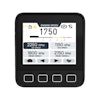
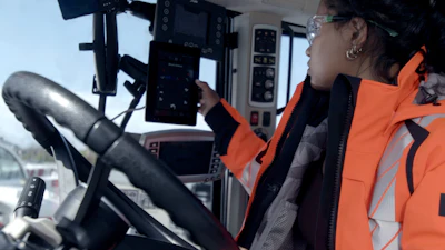
First, consider whether the machine and its intended application is best served by a button-based display, a touchscreen display, or a hybrid display that combines both. Although touchscreens have become increasingly capable and reliable, particularly for operators wearing gloves, physical buttons continue to offer important advantages.  Danfoss Power Solutions
Operators often develop muscle memory for frequently used controls. Once button locations become familiar, they can be used quickly and confidently with minimal visual attention. This increases the speed of interaction and, ultimately, the operation they are trying to execute. Physical buttons also provide tactile feedback, offering operators non-visual confirmation that an input has been registered.
Display technology in the off-highway industry tends to follow that of automotive, which has already reintroduced physical buttons and knobs for commonly used functions. For off-highway equipment, speed of interaction, reliability, and operator confidence make buttons a valuable complement to touchscreen technology. Touchscreen-only systems can still be effective, but designers should ensure the interface is appropriate for the operating environment and designed to minimize prolonged visual attention.
A second hardware consideration is display size. A larger screen is not always better. The ideal display size depends on factors such as available cab space, where in the cab the display will be mounted, and the unit’s distance from the operator. Regardless of size, information must remain readable and accessible from where the operator sits.
If there is flexibility in display mounting location, placement should account for ergonomics and visibility in real-world conditions. Machine designers should consider exposure to direct sunlight and reflections as well as brightness requirements for daytime and nighttime operation.
Sunlight viewability is particularly important. Anti-glare technologies vary significantly among coatings suppliers, and coatings processes vary among display manufacturers. There is no standard that guarantees performance in all situations. That said, physical testing in all expected operating conditions is the most reliable way to verify that a display will remain viewable throughout the workday. On a related note, machine designers should also consider and test the display’s compatibility with polarized sunglasses.
Designing the Display User Interface
Once the hardware has been selected, attention turns to the user interface (UI). Even the most advanced display can create distraction if information is illegible, presents interpretation challenges, or is poorly organized. There are two aspects to designing an effective UI: design and information architecture.
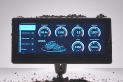
A key principle in UI design is to prioritize glanceability over information density. Operators should be able to ascertain critical information at a glance and immediately return their attention to machine operation. This means resisting the temptation to place every available data point on a single screen. Instead, the most important information should be visually prominent, both in terms of placement and size. Less useful information should be minimized or saved for another screen.  Danfoss Power Solutions
Designers should limit each screen to a handful of primary data elements organized as widgets. Generally, three to four widgets is an appropriate amount per screen, but the exact number depends on screen size and viewing distance. For example, a 12-inch screen can technically accommodate more widgets than a seven-inch screen. But a 12-inch display may be used in a larger machine with a mounting location further away from the operator. In that case, the widgets need to be larger than those on a smaller screen situated closer to the operator.
The type of information being displayed also impacts screen design. Similar data sets, such as multiple pressure or temperature values, can sometimes be grouped together in a single widget rather than shown as separate gauges. The key is ensuring the screen is not cluttered and that operators can quickly understand what they are seeing.
Activation controls is another type of information that requires deliberate design and programming. Touch areas must be large enough to avoid accidental inputs, and controls for important actions may require confirmation prompts or press-and-hold style interactions.
Selecting the right visual communication style can support quick interaction. Icons are often preferable because they communicate meaning simply and across multiple languages. Use of internationally recognized graphical symbols, per SAE J1362 and ISO 7000, can help create familiarity and consistency for operators across machine brands, types, and locations. Text remains important in situations where additional context is required, such as faults, warnings, and diagnostic information.
For text communication, typography choices can help or hinder legibility. Simple sans-serif fonts are typically easier to read and usually the standard for digital displays. Font selection should accommodate the languages required across a machine's target markets, including those that use non-Latin scripts.
Color and contrast are also important. Effective UIs use color intentionally and with consideration for those who have color vision deficiencies, while clear contrast improves readability.
Information architecture — the structure that determines how operators navigate through screens and menus — is the other aspect of UI design that impacts display effectiveness and operator distraction. There is no universal hierarchy that works for every machine or application. However, several principles can help guide decision-making.
First, frequently used functions and information should be easily accessible with little or no navigation. If operators regularly need to adjust a setting or view a specific screen, reaching that function should not require multiple menu layers or touches.
Second, the number of menus and menu depth should be carefully managed. As navigation paths become longer and more complex, operators spend more time looking at the display instead of the machine and its surroundings. Vehicle display UIs often benefit from relatively shallow menu structures, ideally with no more than two or three layers, that help users find information quickly. Transitions between screens — in other words navigating backward, forward, and to a “home” screen — should be intuitive.
Alert management is another consideration. Excessive notifications can create alert fatigue, which could result in operators overlooking important messages. Effective systems distinguish between critical and routine events, helping operators quickly understand the relative importance of an alert through visual and audible cues.
The Display of the Future
Looking ahead, emerging and automotive-crossover display technologies will create new opportunities to reduce operator distraction in off-highway machines.
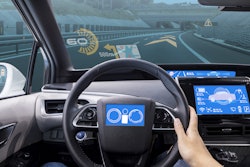
One area generating significant interest is heads-up display functionality. Increasingly common in passenger vehicles, this technology projects critical information onto the windshield without obstructing the driver’s view. The concept has strong potential for applications where operators must maintain a constant visual on the work, such as crane operation.
Voice command functionality is also developing in off-highway machinery. Similar to Apple’s Siri and Amazon’s Alexa, this technology can provide additional ways for machine operators to access information or adjust settings without physically interacting with a display.
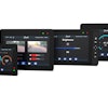
Off-highway display form factors will also evolve, as we see in passenger cars. Wider, lower-profile displays and alternative mounting and integration approaches — such as integral A-pillar displays — could keep information visible while further streamlining the cab environment.
Toward Safer Displays
Displays have become indispensable components of modern off-highway machines. They deliver unprecedented access to machine information and help OEMs streamline cab design and functionality. By carefully considering hardware selection, interface design, and information architecture, designers can create displays that support productivity while helping reduce distraction. As display technologies continue to evolve, maintaining that focus on operator attention will remain one of the most important measures of success.